Interior design is very much like fashion. It changes over time.
Which is why I change the rooms in my home.
Often.
(I wish I had the same passion for fashion as I did interiors but I’m still wearing the same hole-y jeans from 6 years ago).
This wall is the wall that had 9 lives.
First, it was…a disaster.
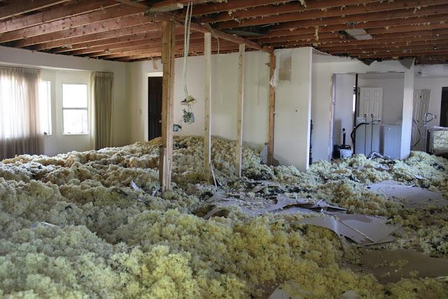
Then it was white.
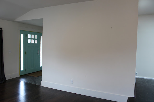
Then I stenciled it.
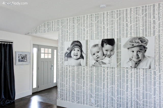
Then it went black.

Loved the black the most but I just painted the opposite wall a faux black shiplap and there was too much black for the room.

So what was next? I considered all my options.
Shiplap? Wallpaper? Crazy color? Muted Color? Trim?
You’re not going to believe what I decided to do.
None of those.
Instead of giving it a makeover, I gave it a make-under.
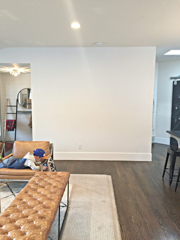
That ain’t primer folks. That’s the wall’s new “makeover”. Plain old white.
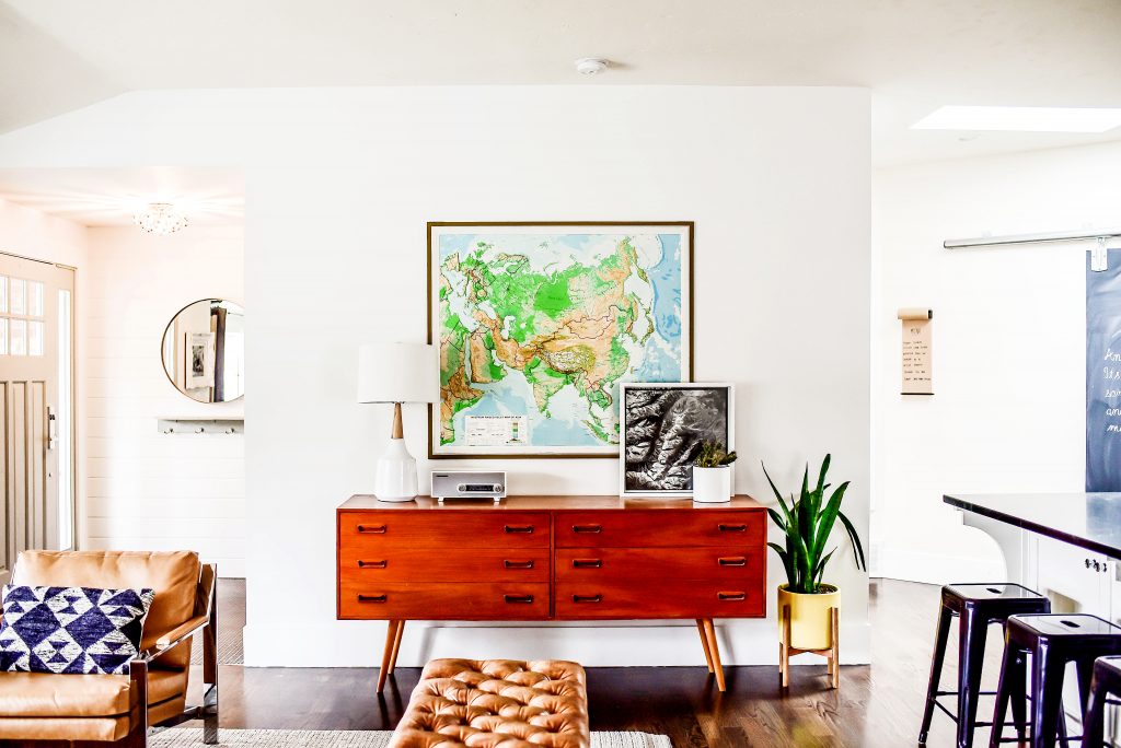
The room serves several purposes…family room, kitchen, dining room, office, homework room, entertaining room. Because there’s so much going on in the room, all the time, it needed to provide some visual rest. No tricks, no gimmicks, no pizzazz. Just a treatment to help calm the room down and a clean, crisp white was the order of the day.
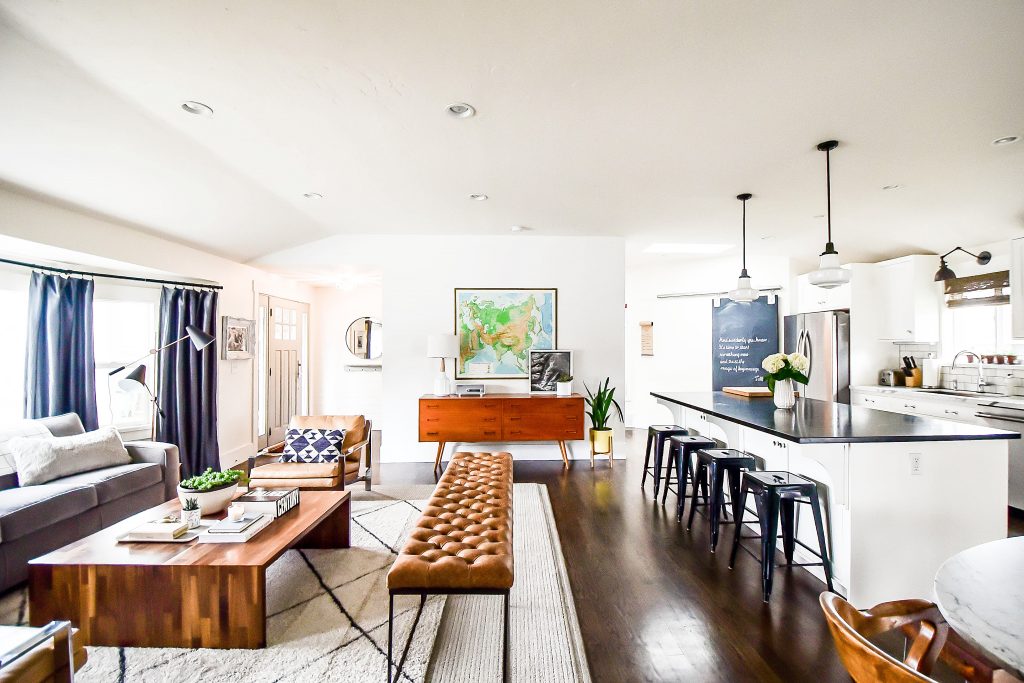
The other reason for the change was the space needed to serve more function. We live in a 1970’s brick rambler. The house is pretty basic and lacks many useful functions that newer built homes now incorporate. There is no dedicated laundry room, no office, no mud room, no homework area, small bedrooms, etc. As a result we’ve had to come up with clever ways for the home to function well for a family of 5. One problem I’ve been battling since we moved in is where to put homework, paperwork and other personal items. We moved the vintage Danish dresser from our bedroom in to the living room. Each family member has their own dedicated drawer. If homework or other items get left out I just put them in the dedicated person’s drawer for safe keeping. It was worked out marvelously.
I’m all for pushing the envelope and doing some kind of design treatment so over the top that it brings you to disbelief but sometimes the lack of visual busyness is just what a room needs. Sometimes less is more. And in this instance, that was the case.


 Hey there! I’m Michelle; I’m an Passionate DIY’er and in constant pursuit of how to bring beauty to my house full of men (3 boys + 1 hubby). Stick around and see what I’ve got up my hard-working sleaves!
May i ask the dimensions of your island please
50″x95″ 🙂
I’ve missed this! I’m so glad you’ll be blogging more! It looks great, I love it!
Thanks so much Jaclyn!!
Looks great! Where did you get that bench? I love it!!!
Thanks Susi! Bench is from CG Sparks.