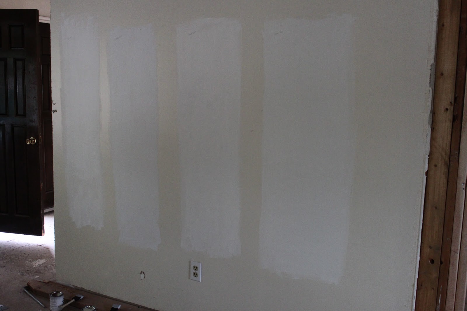
I threw down $50.00 + on 6 different paint samples at Benjamin Moore.
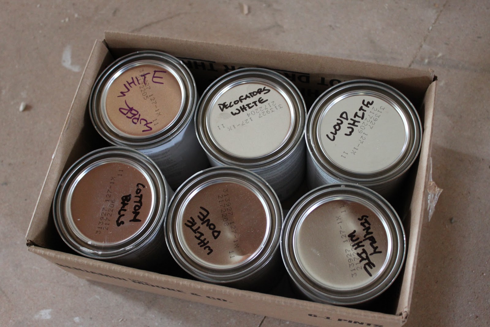
I cannot tell a lick of difference between any of them.
I swear the guy may have forgotten to add any tint (that or I’m color blind).
I need three different whites.
One for cabinets, one for walls and one for trim.
Three colors that blend to make modern but not stark and cold.
Suggestions, PLEASE.


 Hey there! I’m Michelle; I’m an Passionate DIY’er and in constant pursuit of how to bring beauty to my house full of men (3 boys + 1 hubby). Stick around and see what I’ve got up my hard-working sleaves!
Have you tried putting the paint on a white piece of paper? You should really be able to see the difference then.
I read somewhere that the standard colors for doors and trim is Decorators White. That’s what I used in my home – no complaints! It’s not as harsh as a hospital looking white.
They look the same in the picture to me. I was going to suggest painting a piece of paper too, but it looks like you need to take your samples back b/c you should be able to see the difference.
I fyou have the paint sample cards…hold those up to the wall and see if it matches. I make sure I do this when I buy paint — lessoned learned after purchasing 2gallons of paint.
White is soooooo hard! A good friend just built a new home on the water and went with with Chantilly White on the walls which is beautiful (I guess white can be beautiful, right?) And Decorator’s White on her cupboards. Her trim in Chantilly Lace too but in a different sheen. Gorgeous combination!
Oh god, been there, done that. I totally went through this myself. First of all, if you haven’t already, read through the posts on white at mariakillam.com. One of the things she talks about is that you have to take into account the fixed things in your home when picking a white. Generally speaking, if you have brown tones (brown cabinets, brown granite countertops, etc.) you usually want to go a bit creamier. If you have black tones, you want to go a bit whiter.
The other thing to keep in mind is that maybe you just need two colors of white. A lot of people recommend that you do the same color for cabinets and trim. Of course you don’t have to, but it certainly makes it easier. If you’re going for the white-on-white look, I really like it when the cabinets are white-ish and the walls are much creamier/grayer, so you probably don’t even want to look at what appears to be white, but rather very light versions of other colors.
Since all whites really look white when not in the presence of other colors, it might be easiest for you to make a large swatch of something like Super White (which I think is one of the whitest of BM’s whites) and then compare swatches of the other samples you have.
I feel for you, I really do, because I about drove myself crazy (and broke) trying to find the right white. Ultimately we ended up with Mascarpone, which I love and have since painted all of the trim (ok, most of it because a few rooms still need to be done).
And just so you know you aren’t the only one dealing with this, this is just ONE of my posts on the topic. The inside of just about all of my doors on cupboards and closets is full of white paint samples!
http://www.theimpatientgardener.com/2010/02/in-need-of-intervention.html
I always love Cloud White and Decorator’s White. Have you tried painting the colors on different walls to see how they look with different light? Or painting them on pieces of cardboard and moving them around the room?
Good luck! Choosing white is never easy!
Hey there 🙂 Whites can be tough, I agree!! I echo the comment about mariakillam.com — there’s like 200 comments on this post alone where she tackles questions about white paint: http://www.mariakillam.com/2008/11/white-kitchen-cabinets.html
Good luck 🙂
Hi Michelle. I just recently had my kitchen cabinets painted and used White Dove. I used it for the cabinets and all of the trim and moulding in the kitchen. I have pics posted on my blog http://www.abbeysoutherncharm.blogspot.com if you want to take a look. White Dove is not a stark white it has a little cream to it. Hope that helps.
TAbbey
Aren’t whites awful to pick? I just did Decorator’s White on all our walls on the main floor in an eggshell finish and then did the same colour (or lack of!) in high gloss for the all the trim. I’m really happy with the way that it turned out. The different sheen makes it pop without being a different colour!
I wanted the same thing for my kitchen cabinets and went with (and love) Behr’s Cotton Knit.
Been here Michelle – these whites should be different enough for you to be able to distinguish one from another – if not all day – then at different times of the day as the variance of sun and shadow impacts your room. You are not crazy or “color untrainable” for goodness sake! Your past projects make this quite clear. It is certainly within the realm that one or perhaps more were not properly tinted. Do 2 coats directly next to that portion of the chip you have from Benjamin Moore to verify for your own sanity’s sake.
I opted for Super White on my cabinets – and matched trim with a custom mix white that had only a hint of gray, but my walls are custom mix silver gray, so the Super White cabinets really pop.
Good luck – God bless you and your efforts during this exciting time!
Well going with Benjamin Moore was the perfect start:)
When working with white I always turn to designer Suzanne Kasler. I found this article, I thought it might help you…..
“Question/Statement: You painted the living room — walls, trim, ceiling — all one color.
Suzanne’s Response: I was determined to get away from that whole paint-as-decoration thing. And narrowing down to one color creates a kind of envelope that focuses on the architecture. The ivory I used, Benjamin Moore’s Bone White, has a lot of depth to it. The walls are satin, the trim semigloss, and the ceiling flat.”
Somthing you can do is use one color and cut it in half for walls and keep it full for cabinets and trim. That’s what we did in our house and love it!
I finished painting my kitchen cabinets two months ago and after agonizing over multiple paint samples, I ended up going with Benjamin Moore’s Chantilly Lace. It’s a bright white but not as bright as Super White.
Now I’m in the process of building a new home and all of the paint decisions need to be made up front so I’m having the same issues you are (AGAIN)!!!
Regarding BM OC-65 Chantilly Lace. To determine the undertone of ‘a white’ you wish to use, paint up a sample board of Chantilly Lace and hold the white up to it.
Benjamin Moore Swiss Coffee…my favorite white that I use in my house for baseboards, doors, trims, mouldings…whatever.
I use the Benjamin Moore CC-100 Flurry. Every baseboard, column, trim, doors, you name it – every house, same colour. It’s perfect.
We actually used Dover White by Sherwin Williams and have loved it. Its a little creamier but has a nice warmth to it.
We used dove white for all our trim and kitchen cabs. LOVE it.
The white in my house is Swiss Coffee (I know, sounds so stupid. Coffee = white? Apparently the Swiss like their coffee all cream, no coffee….) and it seems to work well with every other color I have.
Good luck!
xoxo
White dove. High gloss on crown and base and satin on cabinets.
Michelle-
I got various white and DEFINITELY could tell a difference. i think you should check with your paint guy. ALSO- I love Decorators White and have used it almost everywhere, but for me it is a little too bright for the ceiling (depending on the room)..so I add just a tad of my room color to it ( I mean a TINY BIT) and it cuts it perfectly. Good luck! I hope you are enjoying Utah…we moved ,too…but just to Phoenix, so I guess I won’t be running into you at Homegoods:( So happy to watch your progress on your blog!!
I JUST finished painting my entire hallway in Ben Moore White Dove. LOVE it!
That’s crazy! There should be quite an obvious difference between those ones… especially cloud white / decorators white. I used ‘moonlight white’ OC-125 on my walls and it is a lovely warm white.
I have used Cloud White quite a bit for trim, and I’ve seen a lot of “White Dove” being used lately as well – both soft and warm.
Try antique white…I love it…it’s nice and warm, I used it for a bed and shelf in my room because I wanted something that would contrast the trim but still be “white”
Hands down…WHITE DOVE! When I worked at a design firm in Richmond this was our “go-to” white. It’s got more warm undertones and doesn’t scream “stark”!! It looks like it’s been there forever, in a really good way. We just did the nursery trim in white dove and it goes perfectly with our antique white furniture from PBK and Ikea.
As a paint color consultant who works with Ben Moore paints most of the time, I have found two whites that are warm and not too yellow. White dove is tried and true and Ivory Tusk is more creamy white than that . I myself have used Ivory Tusk as my trim color throughout the house. You may check out Navajo White as well, warm with gray undertones.
It is a crazy game the light plays, you can always hold a white piece of paper next to them all and see what pops. One of my clients described ivory tusk as parchment on the walls.
Email me if you have any questions, happy to help.
I third the suggestion to call Maria or at minimum study her website for suggestions http://www.mariakillam.com/ This is her specialty; she’s gifted and will save you time and money.
I had this same debate on a job I just finished. Paint the whites on a piece of wood, not on a white wall, and you can see the difference. I suggest painting the cabinets and trim the same color and paint the walls one shade darker. It will still look white, but give the room some warmth and contrast. I used Moonlight White for my trim. Hope that helps.
Chantilly Lace by Benjamin Moore is my favorite white…I just love it! We recently renovated our kitchen and used it for the cabinets, walls and plank ceiling…just different sheens. It’s a white/white but not stark at all. Good luck with your search Michelle! ~Deb~
You has a beautifull blog. I’m interesting to stop here today. Remember, dont forget to visit and gives us your comment into my blog. Thanks for share.
White Dove is my favourite as well, The best way to tell the difference between the whites is to paint them on a white back ground. You will see the differences better that way.
I did Decorators White in my kitchen and regretted it. Go with the absolute warmest. I thought in our lightening the Decorators White ended up looking institutional. White is tough, good luck!
What happens if you paint one color on top of another…can you see a difference then? If not, I’d take them back. I had to get in a color, if you decide to go non-white somewhere else…Worn Glove by Behr. I will never paint another color. 🙂 Good luck Michelle!
Ooh. I see your dilemma. I think you’ll be fine with any white.
my favorite white is vanilla ice cream by benjamin moore. I have yellow throughout my house and it is a nice white to go with Yellow.
my favorite white is vanilla ice cream by benjamin moore. I have yellow throughout my house and it is a nice white to go with Yellow.
my favorite white is vanilla ice cream by benjamin moore. I have yellow throughout my house and it is a nice white to go with Yellow.
my favorite white is vanilla ice cream by benjamin moore. I have yellow throughout my house and it is a nice white to go with Yellow.
Hi, Michelle! Just undertook this same project last year. I ended up choosing BM Cloud White for my cabinets….LOVE THEM! I had a lot of the same concerns that you have and I would do it over again in a heartbeat! I also used Decorator White on my master bed & bath trim and feel like it is too white. I ended up with the Cloud White choice after visiting Pottery Barn and asking what shade they had used for their display cabinetry. I’m not sure what part of Utah you are in but I am in Orem if you want to bring swatches & take a look! Good luck! Choosing whites & neutrals is more difficult than one would think!
White Rules of Thumb:
• If there is green light cast in the space: use something pinky to offset
• If there is blue, use peachy
• If there is yellow, user cooler tone
Gather a variety of white paint swatches and mount them on a sheet of white poster board or white bond (copy) paper. This will help you distinguish them from one another and note their subtleties more easily. Except for red, blue, and yellow, all colors are mixed.
Rooms with Ample Sun
In rooms with more sunlight, your white will look even brighter. Avoid whites with strong blue undertones, as they will look ultra white in the sun. Instead, choose whites with yellow or red undertones. These will appear pink, peach, or yellow against pure white.
Windowless or Dark Rooms
For windowless rooms, or rooms that don’t get a lot of natural light, consider using a crisp white with blue undertones to help reflect light in the area.
In general, whites with red and yellow undertones will create a warmer feel, making your space feel cozy and comfortable. On the other hand, if you want to brighten up a room, choose bluer-toned whites for a clean, crisp look.
Benjamin Moore White Paint Colors
• Super White (cool white, pretty modern/stark)
• Linen White (yellowy-peach tone, has yellow oxide in it) I love this color, but depending on lighting situation, can look a bit dingy. Has a bit of the Martha Stewart-ness about it
• China White (pink undertone, not my favorite)
• Ballet White (a bit taupey, I like it, but may look “Navajo white” depending on lighting)
• Navajo White on the wall, it has a little bit of peach and rose in it
• Mayonnaise (hint of lemon white tone)
• Decorators White (decorators swear by it, but reminds me of China White)
• White Dove (modern cool white, slightly taupe) is a little less yellow than Linen. In recent years the formula has had more gray added to it for better coverage. Now it looks slightly greenish to my eyes
• Cloud White which is just white enough, but never harsh.
• Atrium White, a bright, modern white with a pink undertone, is a great trim color for the rosy Opal (OC-73)
• #925 – clean, fresh and slightly vintage-y
• Lychee (AF-40 ) creamy yellow white
• Marscapone AF-20 slightly pink cast
• Steam AF-15 slightly greeny-taupe
Ralph Lauren:
• Pocket Watch White (WW01)
• Polo Mallet White (WW05)
Philips Paint:
• Philips Perfect color BUTTERFLY WHITE (from G&R paint in SF) – LOVE THIS ONE SO MUCH. Slightly lighter in color and fresher feeling than linen white. a creamy aioli-esque white) also very Martha-esque
Hi, You seem to know alot about choosing white. I am going to paint our house walls and ceiling white. I love the feeling I get from places in Mexico or Greece, that have that stucco white color. I plan to add color with some mexican art and textiles, rugs, but want a really clean feeling in our small house. We have lots of windows. I live in Vermont where it is cold and grey alot so want my house to feel artsy and uncluttered. Furniture will be painted with fun vibrant colors. Any help with white suggestion?
Thanks,
Betsy
One very good decorator says she uses Benj Moore Moonlight White when she wants a white room that is not cold. She says it’s wonderful, it’s her favorite, and she uses it all the time. That just may be my next white!
Hi Michelle, I have been following your adventure for quite some time now! I have just redone my kitchen and used Benjamin Moore’s White Down (CC-50) for my cabinets…it’s nice and warm! I used the ever so popular Cloud white (CC-40)on all my trim and used Natural Linen (CC-90) on my walls (mind you this is more of a warm beige). I LOVE them together! I could send you a picture of my nearly finished kitchen if you would like. lori_r8@hotmail.com
This was me just months ago! I totally relate. I went with Behr’s Powdered Snow as my wall color and it is amazing. Has a perfect warm glow– I just love it every time I walk into the room. It is warm without being cream, and modern without being stark. Best of luck!
I can’t tell a difference between them either, sorry 🙁
http://www.saysskippy.blogspot.com.
I ran into this problem when choosing whites. I can see really tiny subtleties and so it made it even harder and in the end I wasn’t too happy with my white trim color — it’s too white! but I was thinking it was going to look all dark and muddy. ha! just white. Anyway when I had to pick a white for my cabinets, I knew a little bit better to pick a more “bold” white and went with SW duck white which I LOVE its definitely warm, but its not cream – it has more of putty tinge to it. Anyway whites are hard, but don’t be afraid to pick darker whites then you think you would like. Once they get all up and painted they will be way lighter than you think!
For some white help. Check out inthefunlane.com she decorates everything in white, so she might have some advice!
oh and one last thing. We went and shopped marble countertops yesterday… that was even worse than picking white paint!
in our previous house and current house, i used WHITE DOVE by b.moore on all trim, wainscot, shaker panel , molding- and i have painted a few pieces of furniture w/ white dove. it sounds crazy but it is the right white to accent most any other b.moore colors. ive gotten many friends hooked on it. go for it!
If you painted the samples directly onto drywall, that may be the problem. You have to prime new drywall before you paint, or it will soak up a lot of the paint.
Agree! You should prime you walls first (in this case with white) in order to get an accurate colour.
ooh so you are painting cabinets, eh? how exciting! one of my favorite topics 🙂
i hope it works out really well for you. i’m going to start ‘following’ you on google reader.
I just decorators white on my kitchen cabinets and it has a hint of gray to it… Not too stark 🙂
I used the same white (Cloud white) on walls, trim & cabinets…it is seamless & I love it. The only difference was the sheen-eggshell for walls, semi-gloss for trim & cabinetry.
Hi! So I have super white on all my trim in our home and I recently sprayed my entire bedroom walls and trim with Dove White. Dove White has a creamy gray indertone, the perfect white in my opinion. Looking forward to the reveal:)
Denise Briant
Design Savvy of NJ
Hi, how did this color combination work out? I was thinking of doing the same. If you have any pictures I would love to see it!!
Hi!
I’ve posted this on some other blogs/forums, but no one seems to have an opinion. Hope not too late to chime in here.
I live on the first floor of a suburban 1929 Tudor, so my blinds are drawn most of the time. So the place isn’t dark, but I wouldn’t call it “bright.” All rooms have southern exposure on one side, except for the library, which has adjacent windows, eastern and southern exposure. I have nine-foot high ceilings, the floors are medium-dark wood, and my style can best be described as “eclectic” (contemporary mixed with Spanish Revival–lots of inlays). I wanted an all-white apartment, so on the advice of an interior designer friend of mine, I painted all the rooms BM matte Simply White (with BM semigloss Super White trim and BM flat White ceilings, where applicable). The living room has a cave ceiling, so the ceiling and walls have to be all one color. The two bathrooms and kitchen are semigloss Simply White.
Anyway, have lived with this for a month, though at times it strikes me as too WHITE with no nuance. Recently I’ve come across all the gorgeous Daryll Carter (and Daryll Carter-inspired) BM Moonlight White walls/Simply White trim rooms on the Web, and all the rooms in Cloud White, and I’m kicking myself, wondering if I should have gone that route.
If it means anything, I should add that I have an archway between my living room and library. So except for the bedroom, which can be closed off, my entire apartment is open.
Do you have an opinion regarding these color schemes? Is one “better” than the other for me? Should I repaint? OR maybe use Moonlight White or Cloud White for the bedroom only? Should I stick with “white” of go for “off white,” at least in one room?
Thank you!
So weird… I just picked up the EXACT same colors last week (although I also threw in some Mascarpone in for good measure!)… so tricky to find a good white for my north-facing apartment. Looks like I’ll go with Cotton Balls in one room, Cloud White in another and then Simply White for trim.
Also, since the BM store around here doesn’t have pints and I wasn’t willing to spend about $20 per quart so I just did color matching at Lowe’s using their samples… worked for me and they only cost $3 each!
Which white from Benjamin Moore would you recommend for a ceiling that has an east facing room. It is a living/kitchen area.
Thank you!
Sky blue or off-white is best option in my point of view.
Gift Card printing
Scratch Cards
Printed Gift Cards
Can you tell me what wite paint you finally went with?? Having this same dilema and I don’t want to spend a bunch on samples. Our trim is a creamy white, so I want something to contrast with that, but nothing too stark. I keep seeing Dover White, Simply White, Dover White, Cloud White, and Decorators White! HELP!!
Thanks!
Andrea,
We ended up going with Cloud White on the walls and Simply White on the trim. The Cloud white reads very creamy whereas the Simply White is a good basic white…not too stark, not too creamy. I wish I would have done Simply White on the walls…shoulda, woulda, coulda…maybe I’ll re-paint neon yellow next year. Best of luck with your choice. White is indeed tough.
Oooh, I am currently on the same trek. Has to work on kitchen closet and attached den. I’ve never had such a hard time picking ANY color until white was the choice! So far, may go with BM White Dove. Praying!
Peggy
I just painted my kitchen walls Benjamin Moore’s Camouflage. A nice light gray..green..beige. I need recommendations for a nice off while for the cabinets and trim. The kitchen has a north facing window so not a lot of light comes in. I really like Ben Moores White Moonlight and Swiss Coffee…or maybe White Dove??? Any suggestions would be appreciated Thanks!