Recently I was invited to participate in Better Homes & Gardens Room Refresh Challenge. The challenge was to see how different I could change up my living room spending only $250.00 on BHG accessories from Walmart. I was really hesitant to participate. My biggest question was, “Could Walmart be stylish?” It’s not the first place I would think to shop for home decor. However, I was surprised…
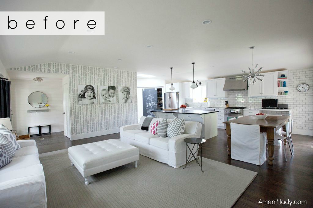
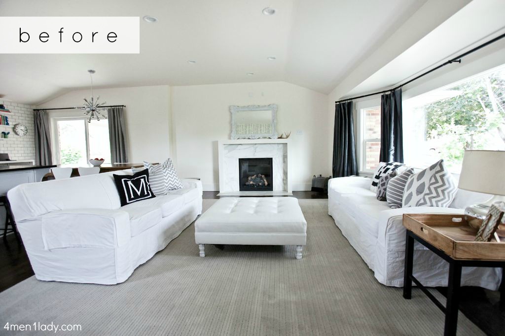
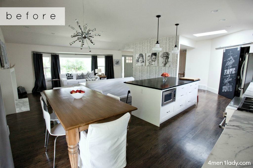
Before the challenge this is how my home looked. In my Arizona home I went wild with bold patterns and colors but I went for a much more muted palette in my Utah home. I don’t know why but I’ve been a little color shy. Everything has been a bit on the minimal side.
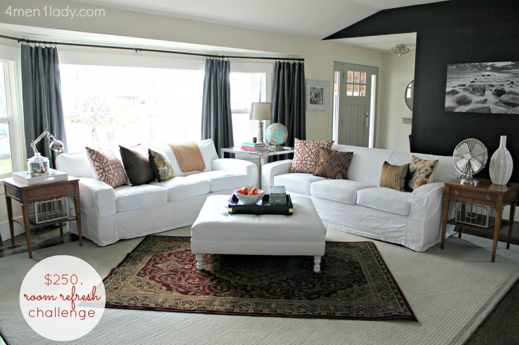
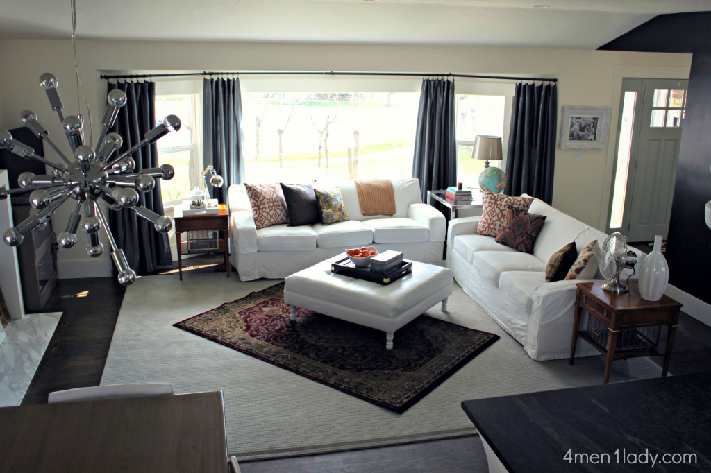
after:
Introducing color and pattern!
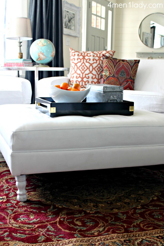
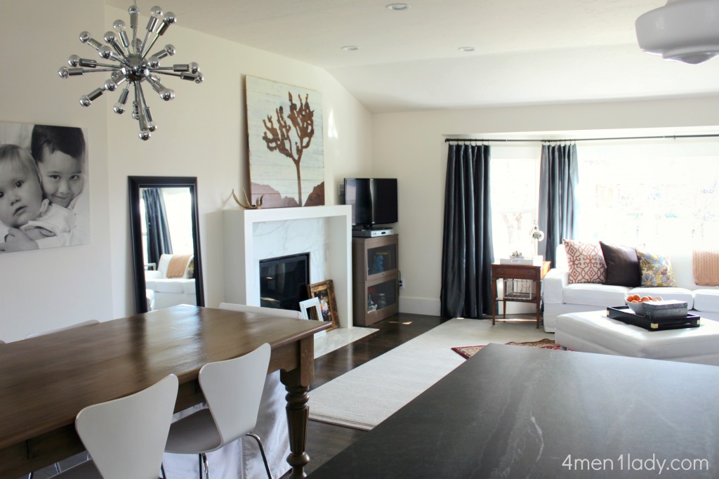
Same sofas, ottoman, curtains and rug…just changed the layout of the room and layered with some accessories.
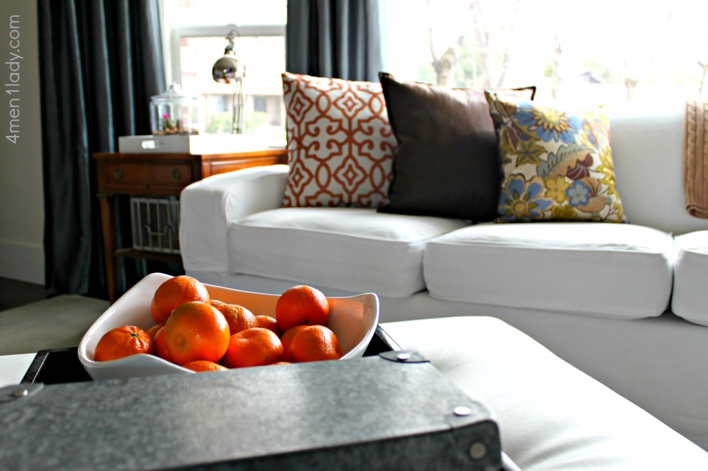
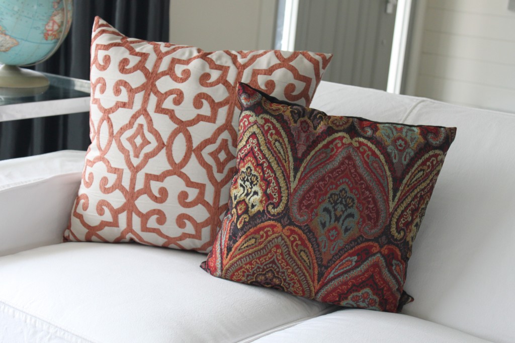
I added a mix of throw pillows and layered on top my existing rug this much more traditional rug with a punch of color.
I’m really liking the mix of modern and traditional elements.
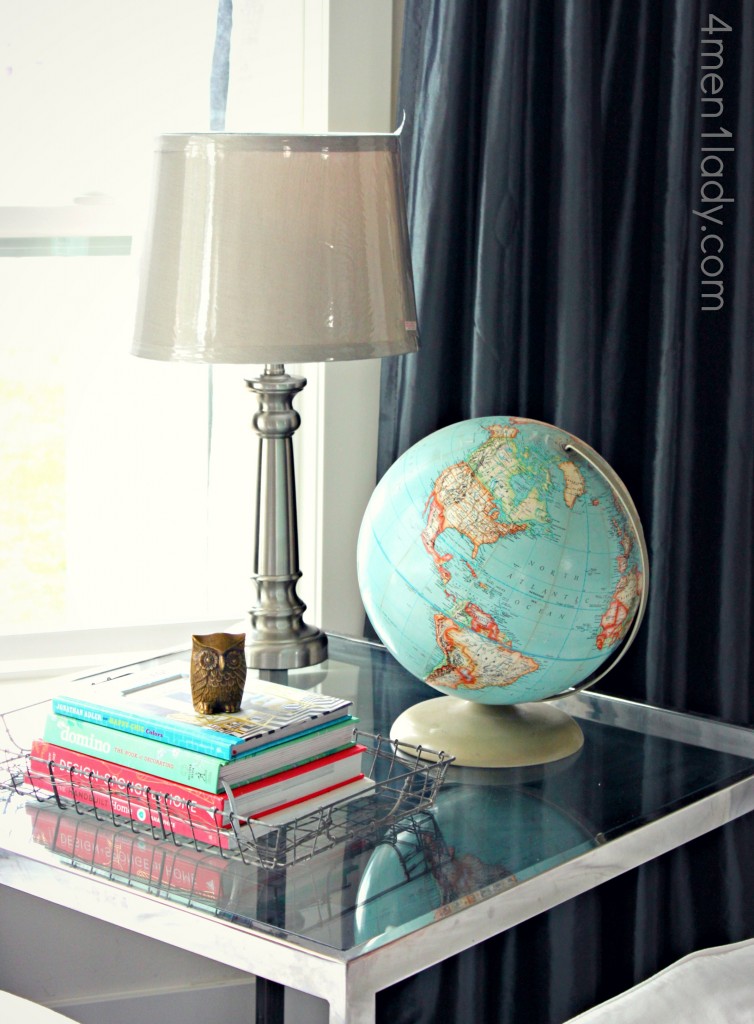
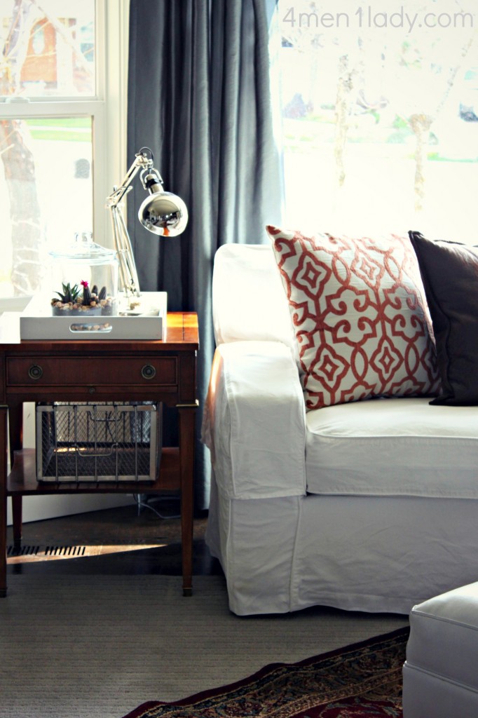
I picked up this new lamp and shade….
and more pillows with lots of contrasting designs and patterns.
after:
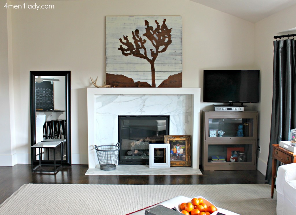
On this other side of the room I simply brought some of my existing furniture and accessories from different parts of my house. You may remember this art piece from my AZ master bedroom which I made from old floor boards. I also picked up this BHG leaning mirror from Walmart and put a stool in front of it.
I’m really thrilled about my new end tables. I picked up the pair for $10.00 each at a garage sale. They’re currently a bit too traditional for my taste so I’m gearing up to paint them and punchy bold color.
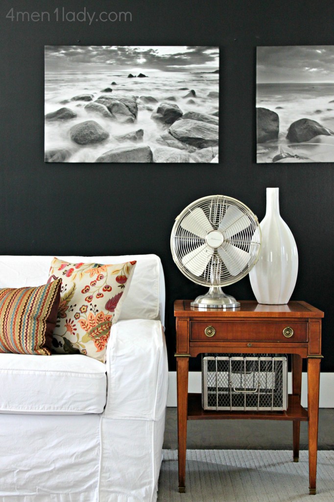
This wall has gone from white to stenciled and now black and am loving the new change.
I’ve had this fan for ages. It’s not BHG but it is from Walmart. I love that it looks vintage but isn’t.
These art pieces are also from Walmart (but not BHG). You can never go wrong with black and white photography.
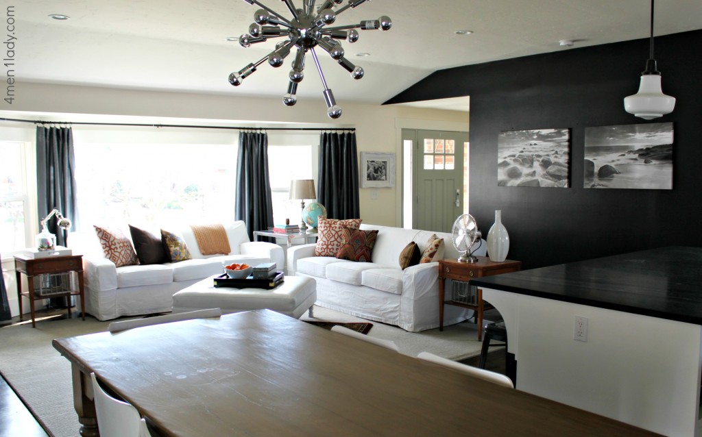 The mood of room feels really good, not that it didn’t before. There is a coziness and warmth that the color and pattern have brought in that I’m really diggin’ for now. This challenge pushed me out of my comfort zone and forced me to experiment with accessories that I normally wouldn’t have gravitated to. Next time you’re at Walmart, you should venture to the home decor side and check it out all the new Better Homes and Gardens furniture and accessories .
Better Homes and Gardens is running a “Pin It to Win It” contest going on right now on Facebook. Grand prize is $1000. gift card.
I received compensation from Better Homes & Garden for my time and participation in the Better Homes & Garden Refresh Challenge. Although we have a material connection, any publicly stated opinions of Better Homes & Garden and their products remain my own.



 Hey there! I’m Michelle; I’m an Passionate DIY’er and in constant pursuit of how to bring beauty to my house full of men (3 boys + 1 hubby). Stick around and see what I’ve got up my hard-working sleaves!

I love it all! Especially the black wall! You are amazing! Can’t wait to see what color you paint your end tables!!!
Awww, thank you Julia! 🙂
Hi – lovely room BUT pleeeease don’t paint the end tables!!! They are a great colour as is – such a shame to ‘modernize’ everything!! Love the punches of traditional with the super modern and vintage 🙂
I love what you did. Your house is so fabulous!
(I was sad to see the birch tree wall go)
Thanks Julia,
(Birch tree wall is still there…just on the other side of the wall).
love the changes. just shows how you can change the mood of space with just a few well-placed accessories!
It’s very beautiful Michelle!!! You are in the right job :)))
Have a good day!
Guylaine
I like this a lot! And I actually like the end tables as is; why I can’t I find something like that when I’m out thrifting? 😛 Oh, and I have that same rug in my bedroom.
I know, right! People swear by yard sales but my luck with those things is like .5%. By the time I add up the gas and man hours I’ve spent searching for something cool I mine as well go pay full price for something new. That is a nifty rug, isn’t it! Great minds think alike. 🙂
I love the new look, Michelle! Really gorgeous. And the black wall looks so good!
PS. Thank you for linking your bathroom post with the darker grout in my post yesterday; I love the way yours turned out!! I’m 110% a fan now!
Awww, thanks Annemarie!
Oh I love your muted palette! I am a big lover of having a neutral base and then piling on some color in cheaper, and easily changeable ways. I love it!!! Still has so much personality!
Thanks Lindsay, it’s def been a fun change!
I honestly can’t decide which one I like more…but that black wall I think made a big difference. Love both looks though. Can’t help thinking we need a plant somewhere 🙂
Michelle, they are BOTH fantastic décor jobs…both are sooooooooooo LIVEABLE, I always say whatever blows up your dress! Changin’ it up is FUN and makes us SMILE. You just rock no matter…..and yes, WAL-MART? Having been a military wife for 21 yrs and 10 moves under my belt, I got REALLY creative in our SPACES each time we got “handed” a new home. We are all so blessed to have the access to such amazing choices here ……keep on CREATIN’ ! 🙂 I do FAVOR COLOR COLOR COLOR! We are having our Southwest Desert home painted (EXTERIOR) next month and it’s going to be rockin’ hot terra-cotta-ish (think Sedona colors) and 3 shades of EGGPLANT!!! Hoo hooo….color makes me HAPPY! LOVE, Janice in Oro Valley, AZ
Well done! I like how by changing up the accessories / accents the room has a completely different vibe. While I like both looks, the new style is very cozy and inviting.
Looks nice! What happened to the gallery wall with a bunch of different art on the black wall? The two black and white pics look great, though.
Took them down just to try something new. 🙂
Wow! Blown away by all the beautiful design inspiration!
Hi Michelle! I am IN LOVE with your black accent wall and curtains. Job droppingly beautiful! You know, I sort of like the traditional look of your end tables with the more modern looking black and white. So inspirational. Thanks 🙂
Thanks Sharon!
Michelle,
I am just now reading this post and I am in love with what you’ve done!! Would you mind sharing what color/brand you went with for the black wall? Thanks so much!!
Loving how warm and cozy the room looks with the more traditional accessories. Typically, my style is more stark like your “before”, but this definitely inspires me to add some color!
Thanks Cindy. Kind of liking a little color too!
Hi Michelle, I’m new to your site, and LOVE your style. Question for you…I’m about to redo a guest bedroom, it’s kinda dark, just one small window. But I really want to paint the one wall behind the bed in a dark charcoal grey and the remaining walls a soft/off white. Bedding will be in greys, yellows, black and cream. Do you think it’s ok to paint one wall so dark in a relatively small and not bright room? Thank you for any advice!
Absolutely! Go for it. In my last home the rooms were tiny!!! I painted one wall a dark brown and it really anchored the room and gave it drama. Here’s the link: https://4men1lady.com/guest-room-makeover-on-a-budget/
Hi Michelle! Just discovered your site and love all your tutorials! I am in love with your black/white/grey aesthetics! Our house is in the same color scheme, but way less designed or organized.
My question is about your big wall of windows, specifically the drapes you installed. Did you have to custom make those rails or were you able to find ready made pieces that fit your space just right?
Thanks!
I actually found the drape rods and curtains at Bed Bath and Beyond. My mom hemmed the curtains for me but they are just from a regular old big box store. Hope that helps! 🙂